Real-time collaboration tools have transformed how teams work together, but testing these features presents unique challenges. When multiple users interact simultaneously—editing documents, sharing screens, or updating dashboards—the interface needs to respond fluidly across devices. This is where MacBook mockups become invaluable testing assets.
Visual Testing Without Physical Devices
Testing collaboration features traditionally required multiple physical devices, which became expensive and logistically complex. A MacBook mockup solves this by allowing teams to simulate various user scenarios on screen. Designers can populate mockups with different user states—one showing an active editor, another displaying a viewer’s perspective, and a third revealing notification states—all within a single testing environment.
This approach reveals interface conflicts before they reach real users. When Sarah edits a cell while Tom scrolls through the same spreadsheet, does the interface show their actions clearly? Mockups let you visualize these scenarios side-by-side, catching issues like overlapping cursors or confusing presence indicators.
Stakeholder Communication Made Clear
Explaining how real-time features work to non-technical stakeholders often leads to confusion. Static wireframes fail to convey the dynamic nature of collaboration, while live demos can be buggy or incomplete. MacBook mockups bridge this gap perfectly.
Picture presenting three MacBook screens arranged horizontally, each displaying a different team member’s view during a live editing session. Stakeholders immediately grasp how cursors move, how comments appear, and how changes propagate across users. This visual clarity accelerates approval cycles and reduces misunderstandings about feature requirements.
Testing Responsive Behavior Across Scenarios
Real-time collaboration features must handle various edge cases gracefully:
- What happens when connection quality drops for one user?
- How does the interface indicate when someone’s viewing versus actively editing?
- Where do notifications appear when three people comment simultaneously?
- How does the cursor positioning adjust when users have different screen resolutions?
Mockups allow designers to prototype these scenarios visually, testing each state’s clarity before writing code. You can create a sequence showing degraded states—full collaboration, then limited connectivity, then offline mode—ensuring users understand what’s happening at every stage.
Real Examples of MacBook Mockups in Action
Figma’s design team uses MacBook mockups extensively when refining their multiplayer editing features. They create mockup series showing how multiple cursors, selection boxes, and user avatars appear simultaneously, testing for visual clutter before implementation.
Notion’s product designers employ mockups to test their real-time block editing system. They arrange multiple MacBook screens showing the same page from different user perspectives, ensuring that changes sync visually without creating jarring jumps or confusing intermediate states.
Microsoft Teams utilizes mockups when designing their screen-sharing interfaces. By displaying both the presenter’s and attendees’ views in MacBook mockups, they identify when controls overlap with shared content or when reactions obscure important information.
Miro’s collaboration platform tests whiteboard interactions through mockups showing various user actions—drawing, commenting, moving objects—happening concurrently across different screens, helping them optimize cursor rendering and object lock states.
MacBook Mockups on ls.graphics
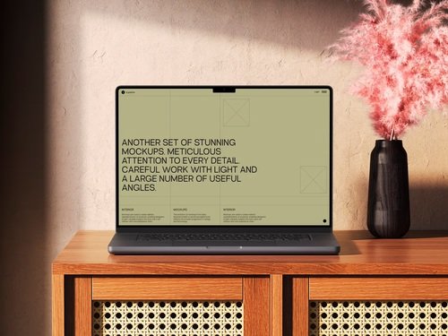
The ls.graphics website offers exceptional MacBook mockup resources that elevate testing workflows. Their collection stands out for several compelling reasons:
- Premium quality with ultra-realistic rendering makes every presentation look polished and professional, ensuring stakeholders focus on your collaboration features rather than questioning the mockup’s credibility.
- Organized layers allow designers to quickly swap screens, adjust shadows, or modify backgrounds without wrestling with complex file structures or technical complications.
- Multiple angles capture different presentation needs, whether you’re showing overhead workspace views for team collaboration scenarios or close-up screen details for interface precision testing.
The platform also provides:
- Different color styles that accommodate various brand aesthetics, from sleek space gray to elegant silver finishes that match your design language.
- Stylish minimalistic compositions that keep focus squarely on your interface rather than introducing distracting environmental elements or cluttered backgrounds.
- Very easy-to-use templates requiring minimal Photoshop knowledge, letting even junior designers achieve stunning results within minutes of downloading.
Conclusion
The distance between a brilliant collaboration idea and a flawed implementation often comes down to how thoroughly teams test multi-user scenarios. MacBook mockups transform this challenge from a resource-intensive burden into a streamlined creative process. They let you spot the moment when three simultaneous cursors become visual chaos, or when a notification overlay blocks critical information—all before a single line of production code is written. As collaboration features grow increasingly sophisticated, the gap between teams using quality mockups and those relying on guesswork widens dramatically. Platforms like ls.graphics recognize this shift, providing designers with the visual precision tools that separate memorable user experiences from frustrating ones.